


B2B-INFOGRAPHIC
B2B, the year that was! 2018
LOOKING BOTH WAYS:As a trend studio, we are very lucky to be looking both ways! When we look at future directions, they are always rooted in early signals, in the here and now. What a rollercoaster year of change it has been! Continuing polarities in political, economic and environmental changes leave their mark on culture, people’s behavior and emerging trends. As we all seek to navigate the future, let’s see what went down with color and style this past year! We have some visual graphs of what people looked at, liked and loved to take home with them all of this past year.

|
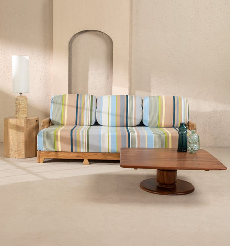
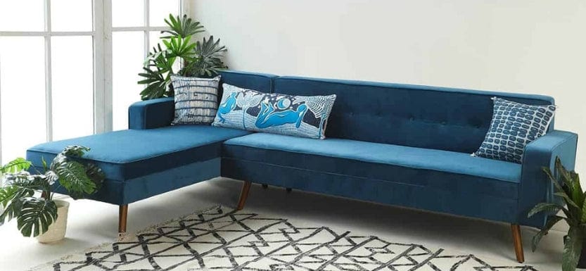
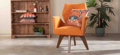
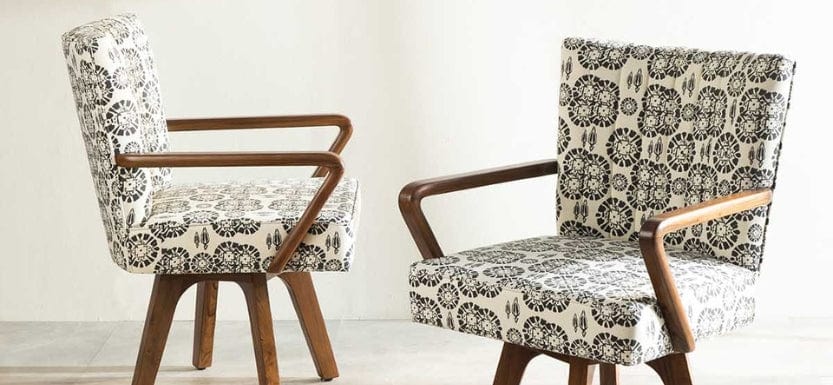
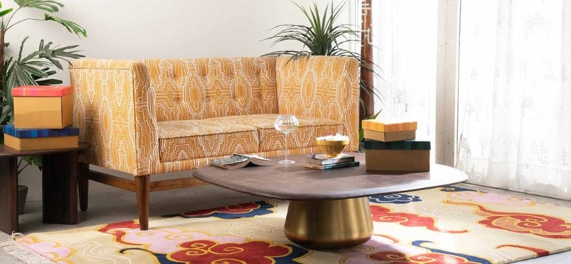
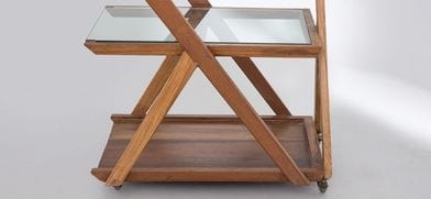
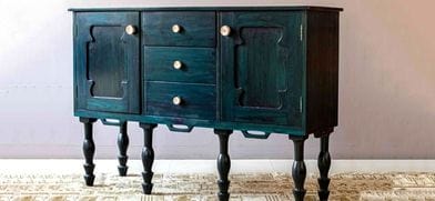
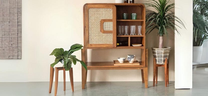
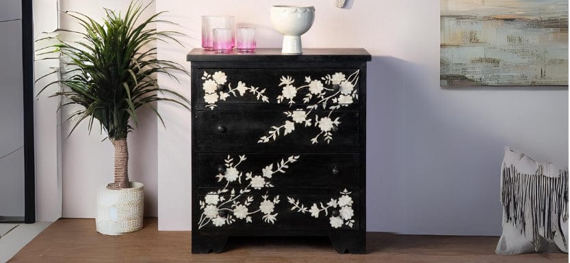
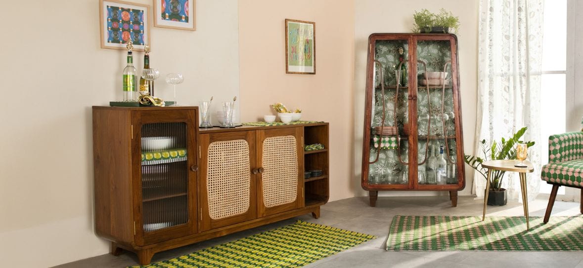
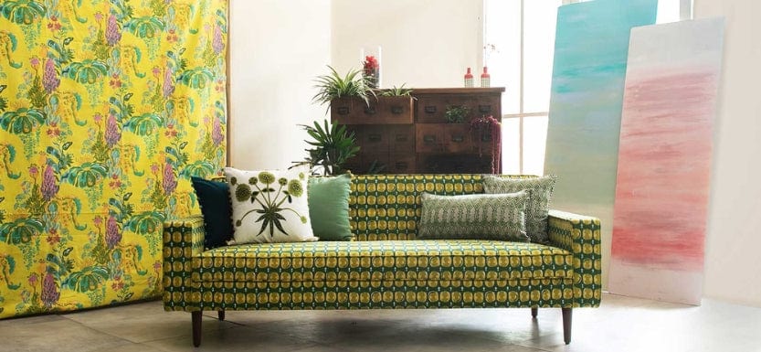
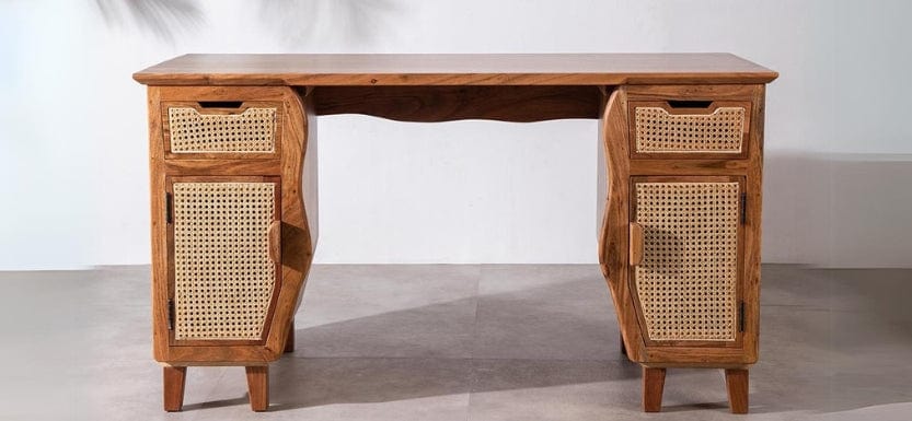
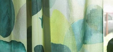
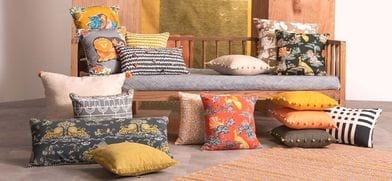
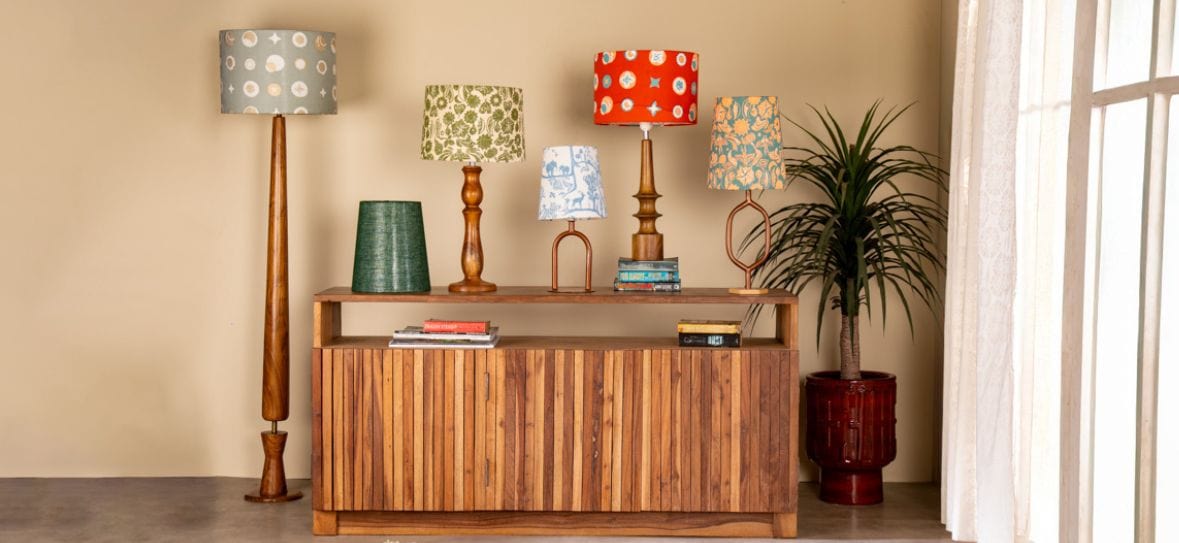
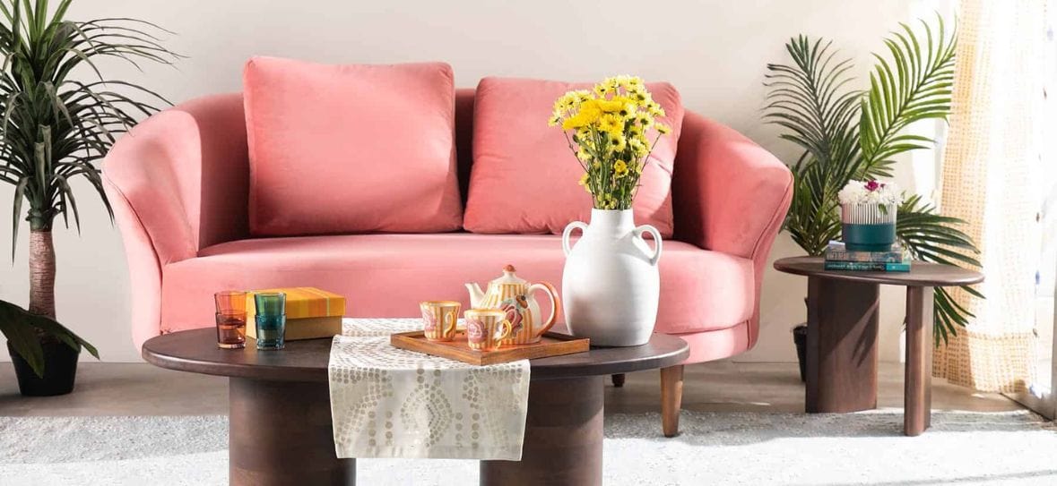
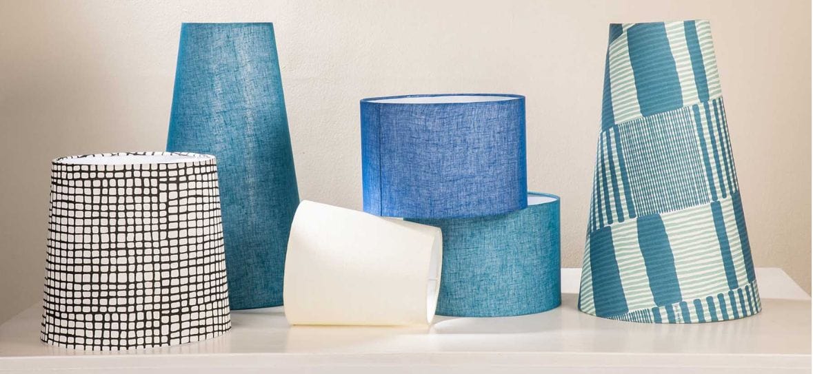
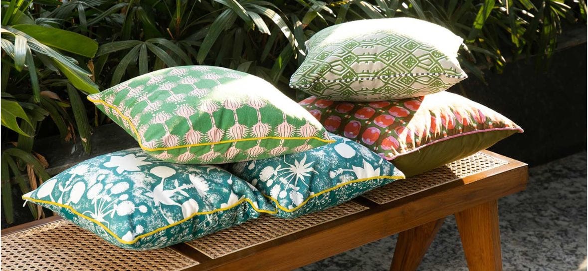
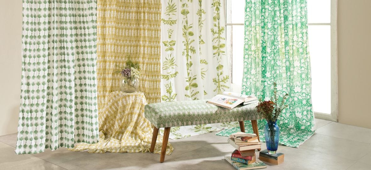
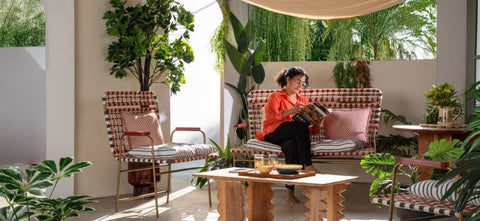
LIVING ROOMS Color always makes people happy. Even living rooms have seen amplification in the use of hues! People have used deeply relaxed blues with Artistic styling for living rooms. Tropical Modern homes have been a big trend, with lighter natural light-filled spaces, using fresh greens and prints full of foliage and botanical references. This year we also wove neutrals into our color schemes. Trendy yellows with graphic neutral. We saw a softer styling of industrial furniture with woods stained down to a soft colored grey. Neutral tones gave the rooms an instant contemporary chic. |
 |
|
|
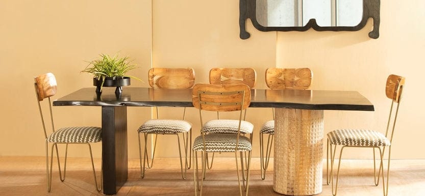
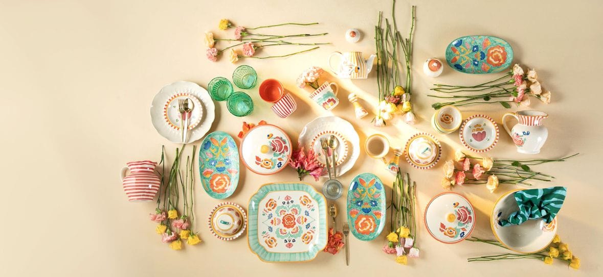
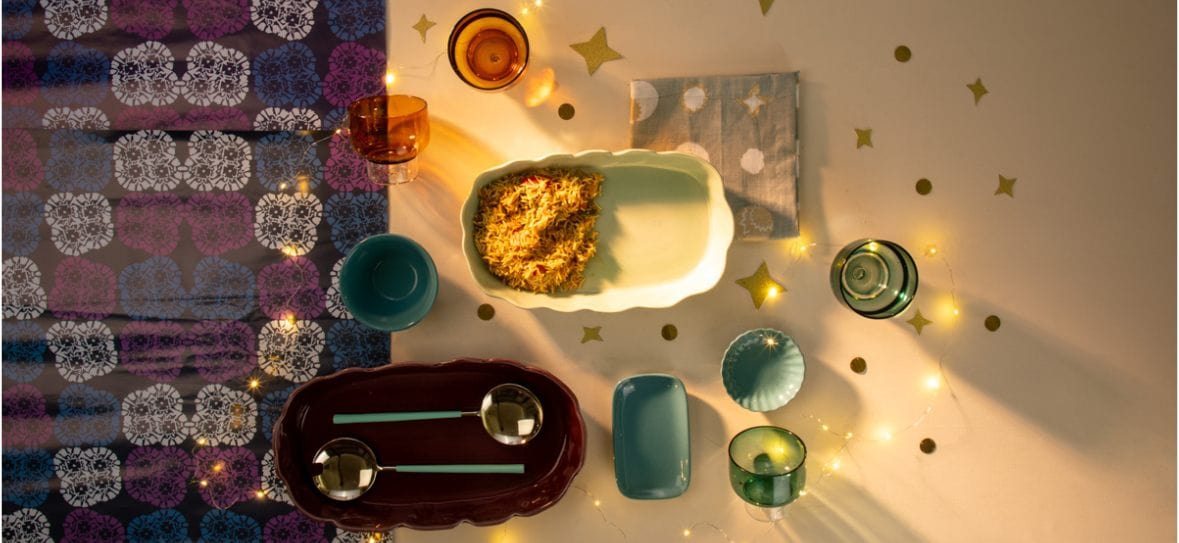
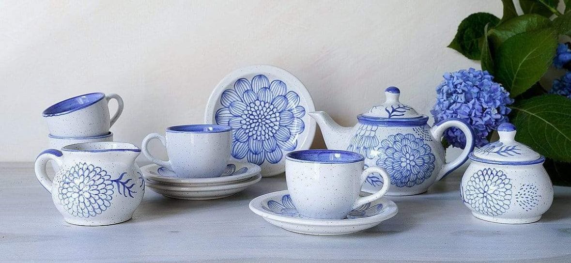
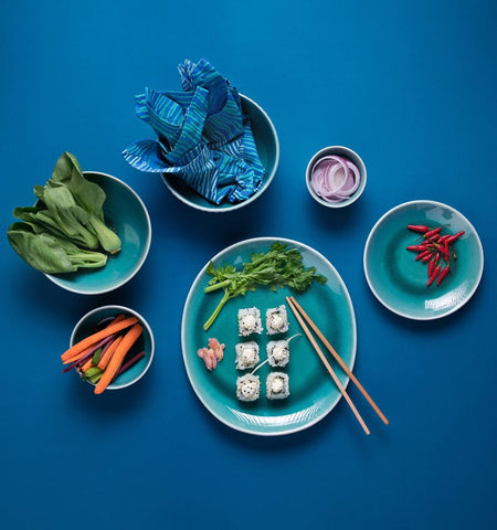
DINING ROOMS Trends in food are a great marker of what is becoming mainstream. People just can’t seem to get enough of the sweet stuff. Delectable colors of mint, coral and cream were top picks by chefs and home cooks alike. Cake stands, ramekins, jugs, and mugs made table settings oh so pretty! A flip side saw a huge interest in regional cuisine and specialty cooking. So small plates, unusually shaped unfurling white platters, became the canvas for degustation. Studio pottery, with sumptuous glazes that looked like cosmic orbs, in rich reds and mossy grey greens were a dramatic backdrop to food; with shimmering cutlery in copper and iridescence the highlight! |
|
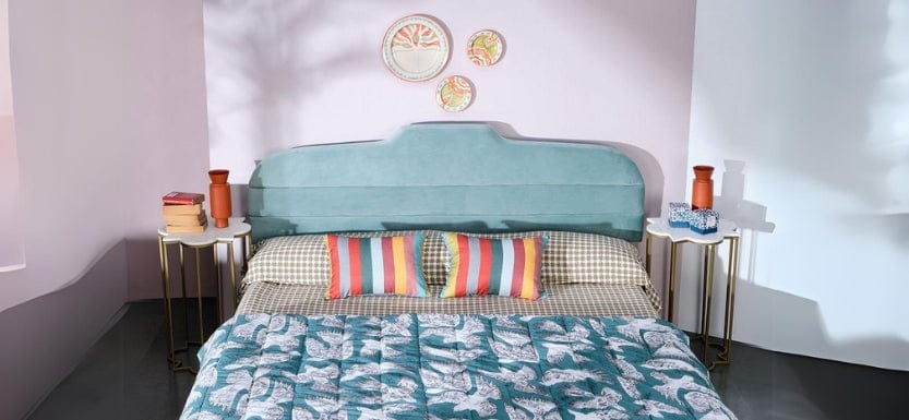
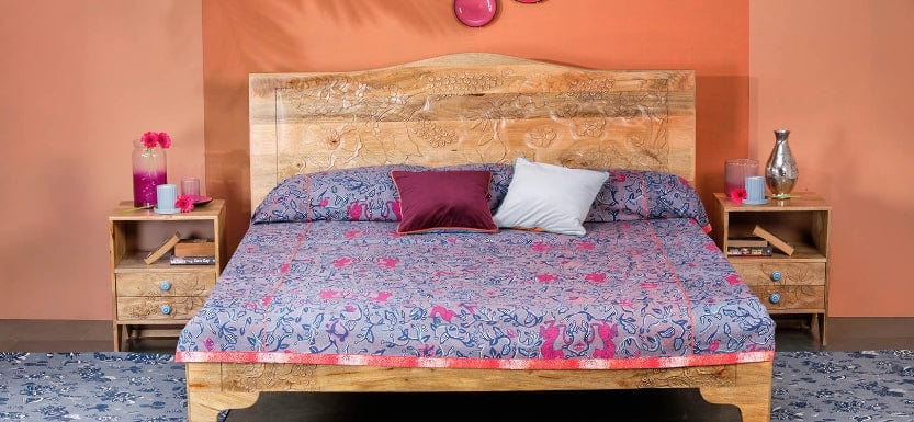
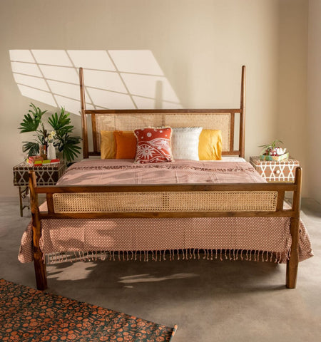
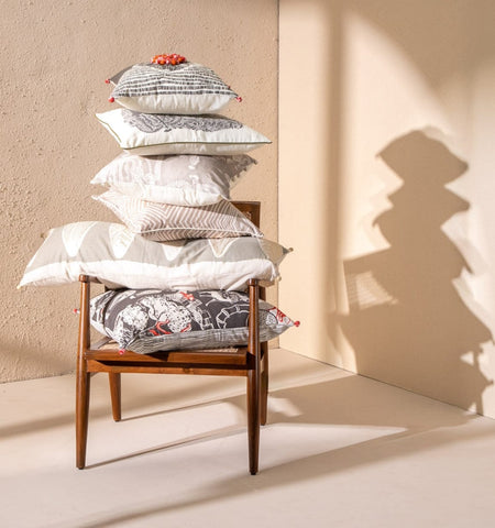
BEDROOMS To some, bedrooms are a silent private zone, while to others a cozy, intimate den. This remains the room in which we are almost ready to experiment with colors. Harmonious rooms, with a close color, connect seemed to be trending. Bedrooms have become so personal, that almost all color families abound, the reds, the greens, blues yellows, and neutral tones. For a silent zone, smoky cerebral colors of grey black and white gave us all the neutrality required. A need for rest coupled with radiance took us to a fresh palette of yellow and greens. Bedrooms are about intimacy and also about caring. Soft colors of peach and aqua together are like a tender touch to the skin and a gender-neutral combination. The quirky color pop accent in reds on the bed became a talking point for when we were ready to break the silence! |
 |


Leave a comment