


Color Trend Forecast for 2016 Homes
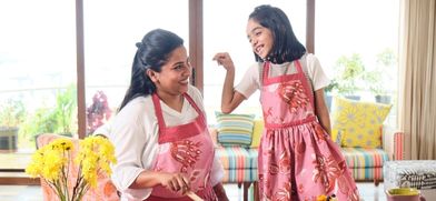
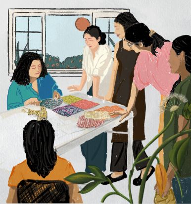
In India, Colors have always been interwoven with Indian traditions and heritage since time immemorial. From symbolic colors worn, to those for festivals. How does a ‘traditional’ scenario adapt to trendy colors when we talk of a new India, in step with the world?
Globally, Color forecasters pick up trends from the happenings in society which inevitably affect people. They also pull information from a variety of sources and piece it together. Always keeping their antenna alert, searching for whats hot, whats new.


Source : AkzoNobel Global
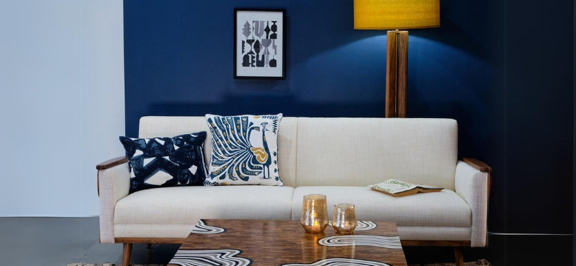
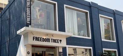
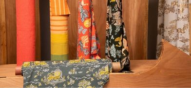
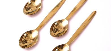
For 2016 we find ourselves at a unique crossroads in time where we can see the advantage both of tradition and also of modern innovation. Digital and modern techniques are here to stay but we look for inspiration from the past to be able to design for the future. Looking Both Ways – with Cherished Gold being identified as the color that best connects all the keys trends for the year.This theme of duality is the driving influence for 2016, according to the Colorfutures team at Akzo Nobel. Freedom Tree’s founder, Latika Khosla is one of the leading design and color experts who develop these ideas at the Global Aesthetic Center.

Source :Dulux
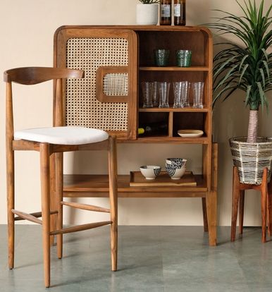
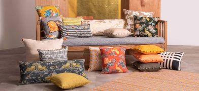
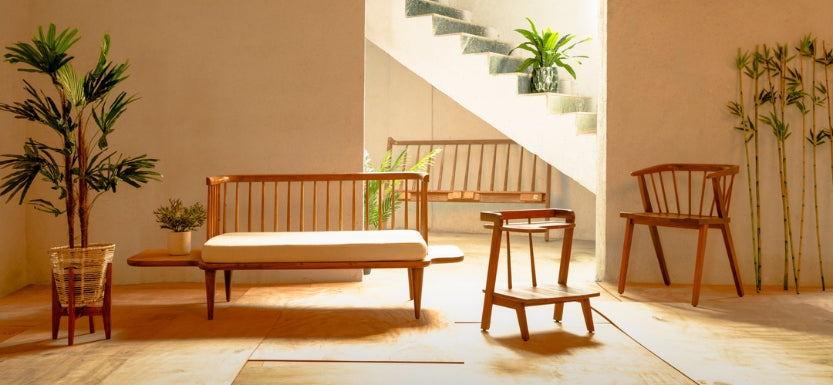
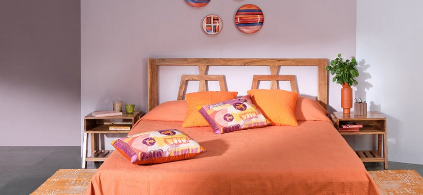
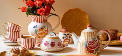
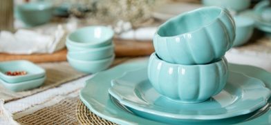
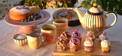
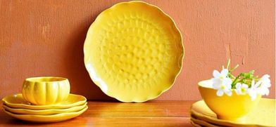
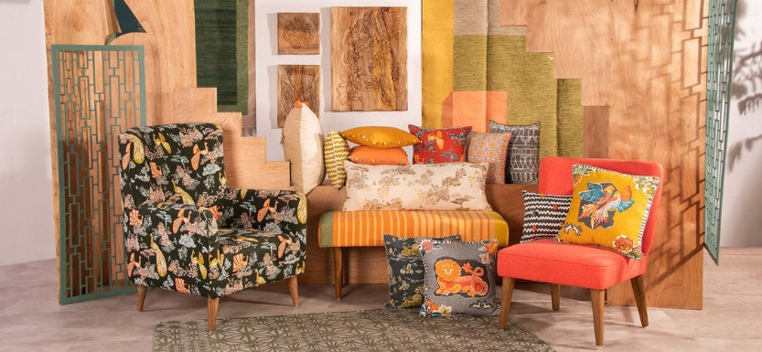
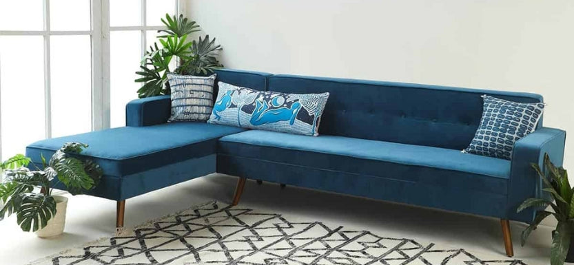
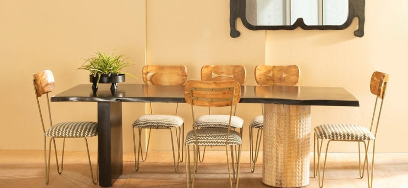
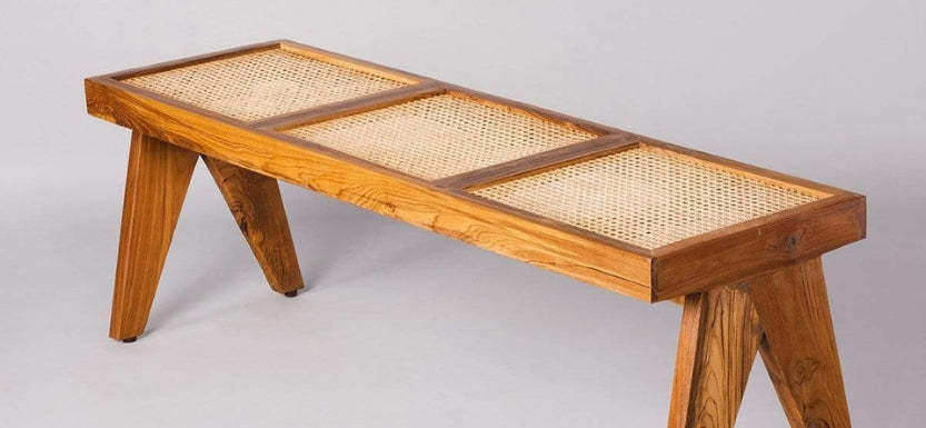
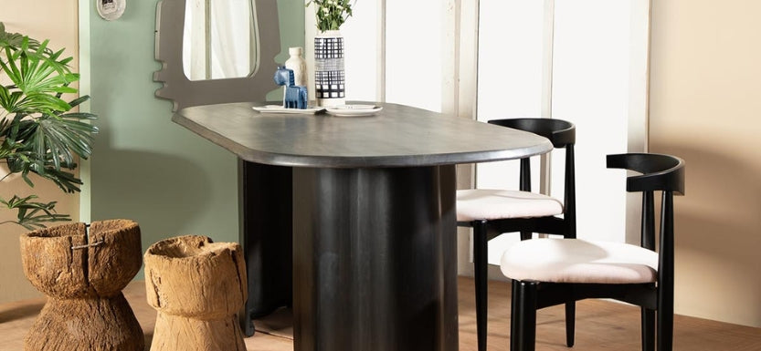
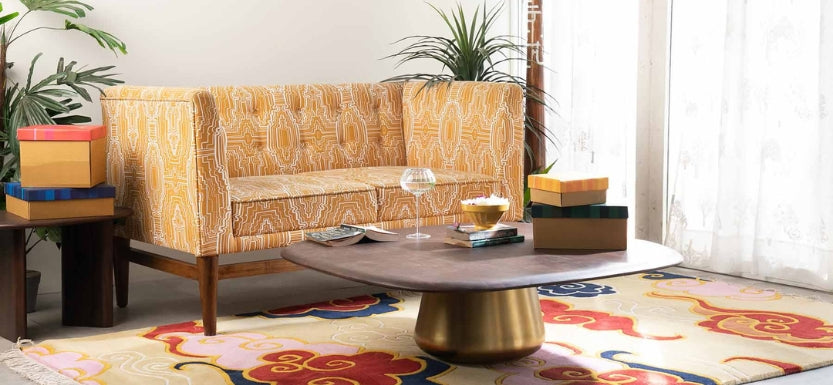
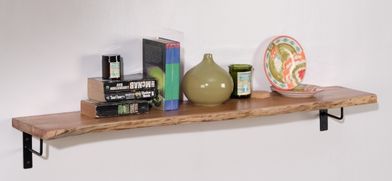
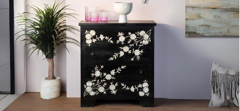
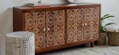
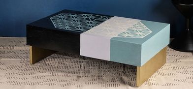
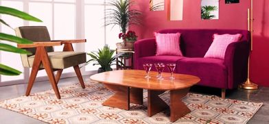
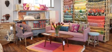
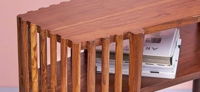
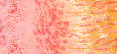
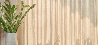
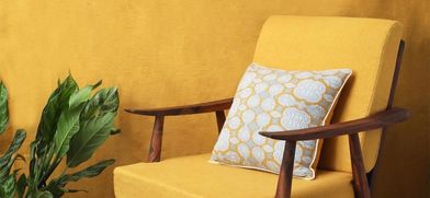
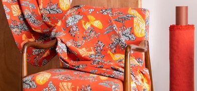
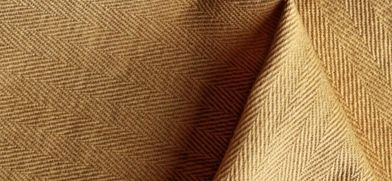
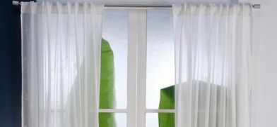
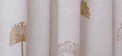
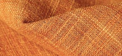
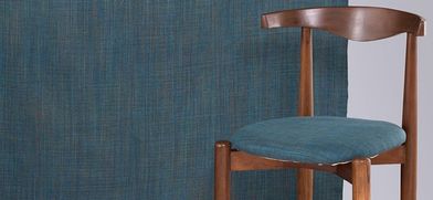
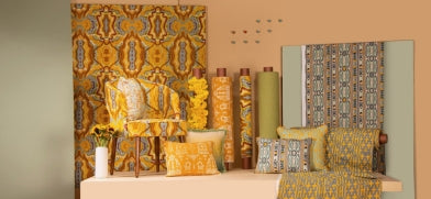
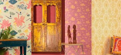
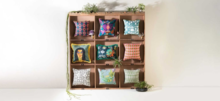
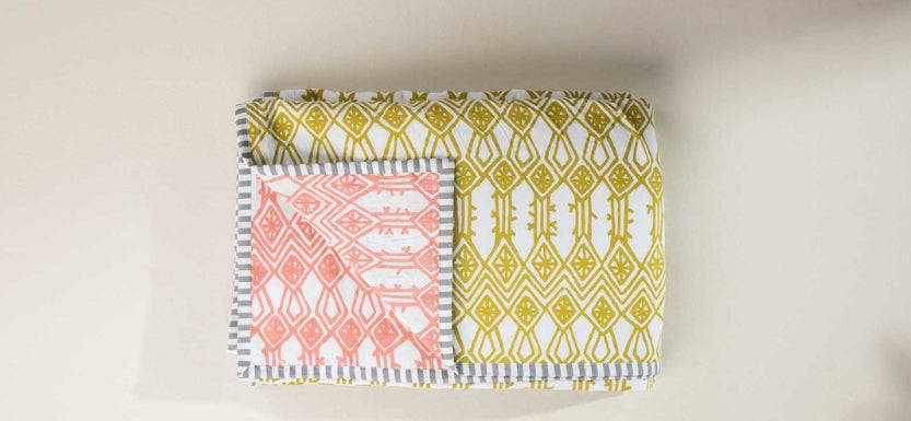
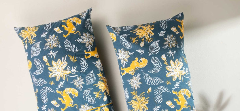
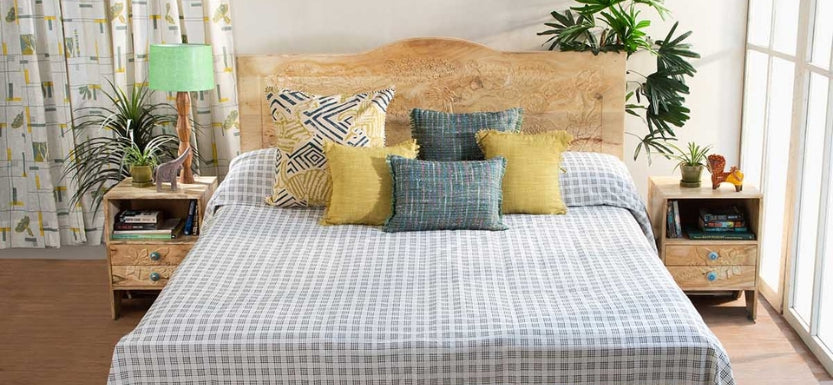
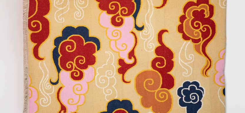
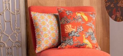
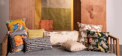
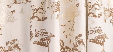
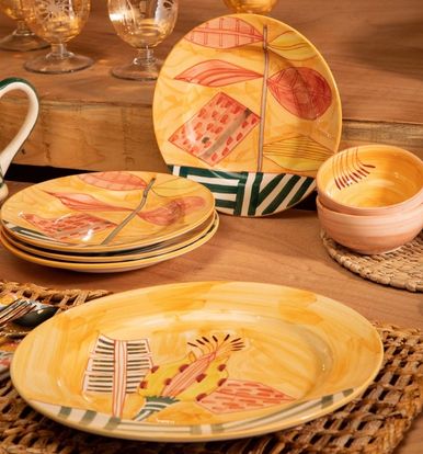
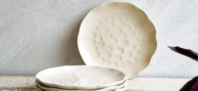
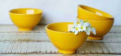
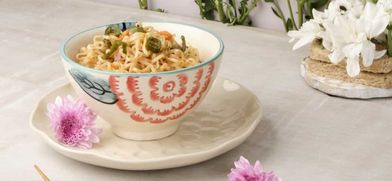
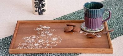
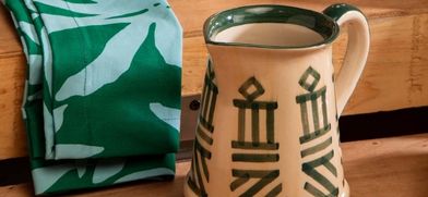
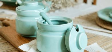
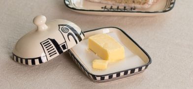
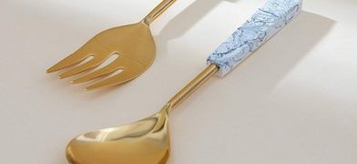
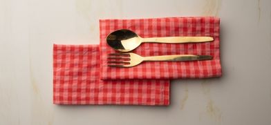
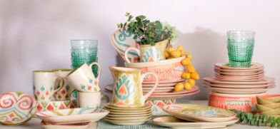
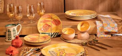
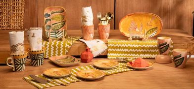
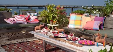
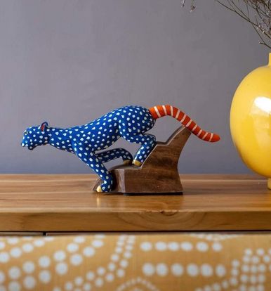
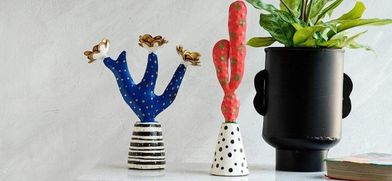
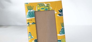
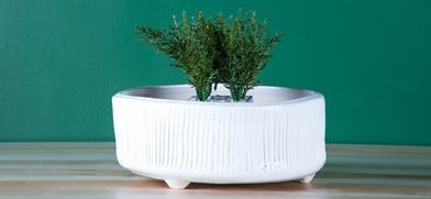
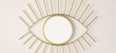
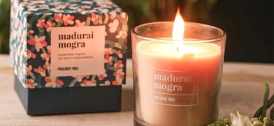
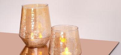
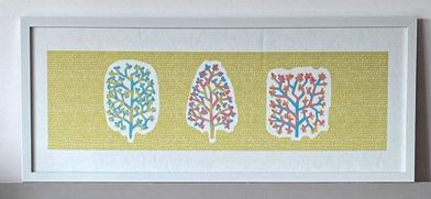
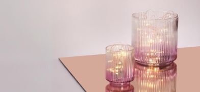
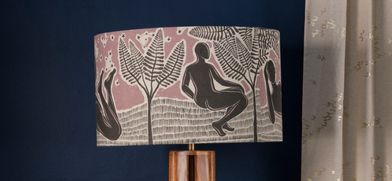
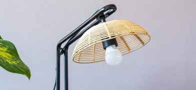
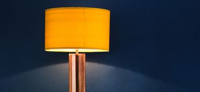
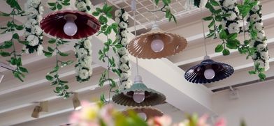
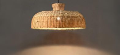
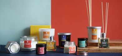
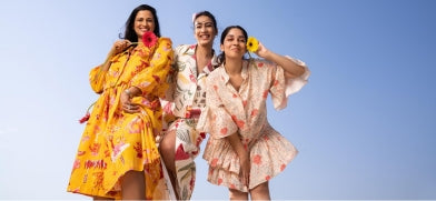
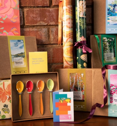
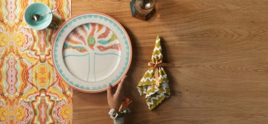
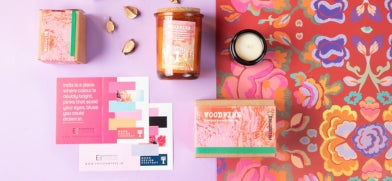
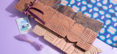
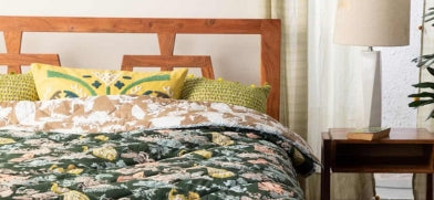
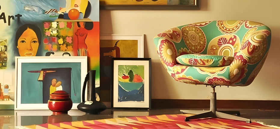
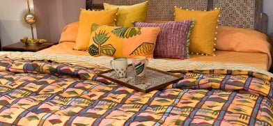
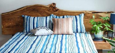
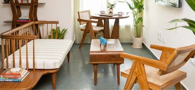
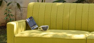
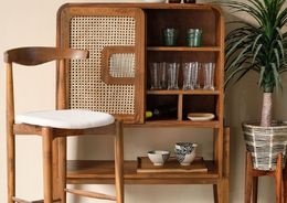
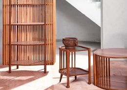
An OCHRE GOLD as the color of this year is also a color easy to bring into Indian homes. The trend leans towards warmer metal tones. If we look to the past, a patina gold from ancestral paintings and the aged luster of glass, is the inspiration. A hint of the metallic gold can be brought into the interior on decor objects; an aged mirror frame or a gently lustrous hammered lamp base. The intent is to keep the metallic gold influence subtle and chic when bringing it into contemporary homes.


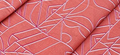
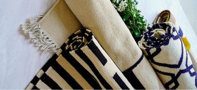
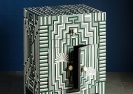
OFF THE GRID
We increasingly seek the appeal of going ‘off grid’ in order to find oneself in the modern world. Digital dependence values the chance to produce something physical and tangible. We need boundaries in which to live, even if we seek to rebel against them; freedom is only understandable within the context of a framework.

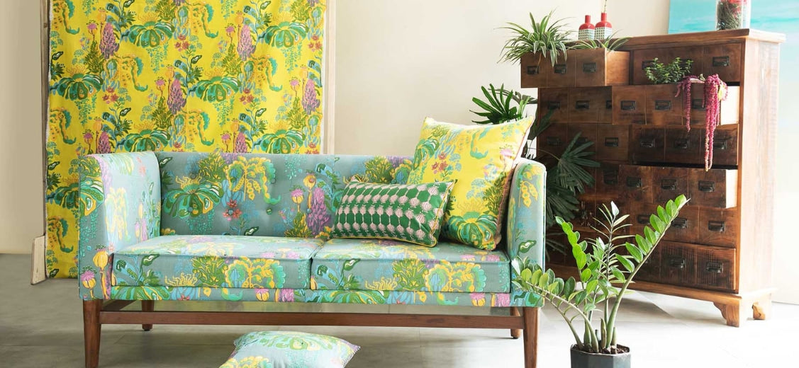
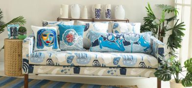
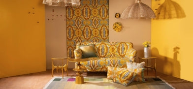
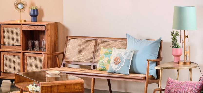
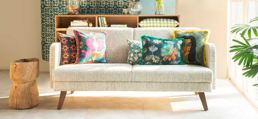
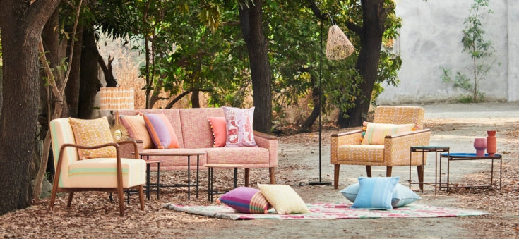
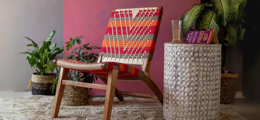
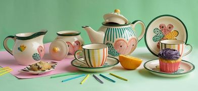
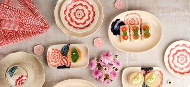
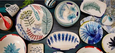
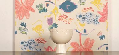
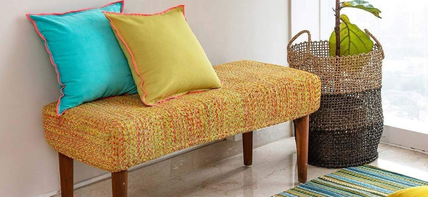
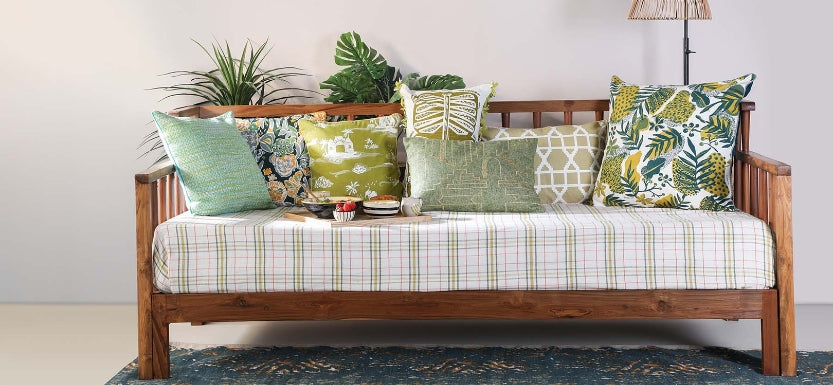
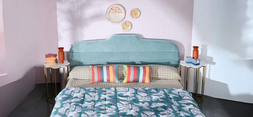
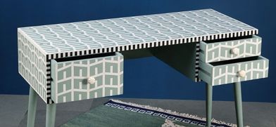
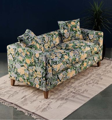
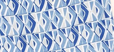
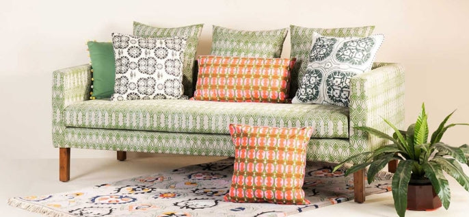
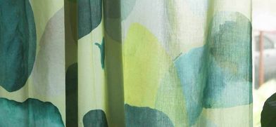
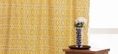
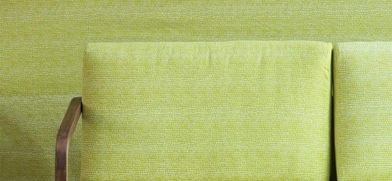
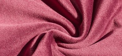
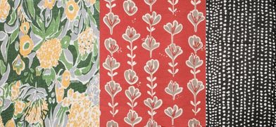
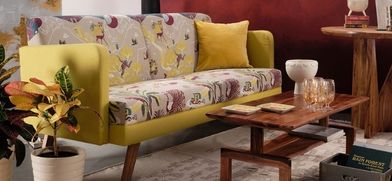
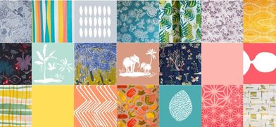
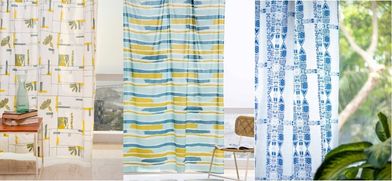
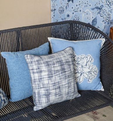
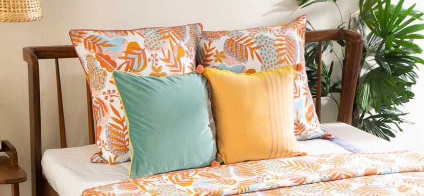
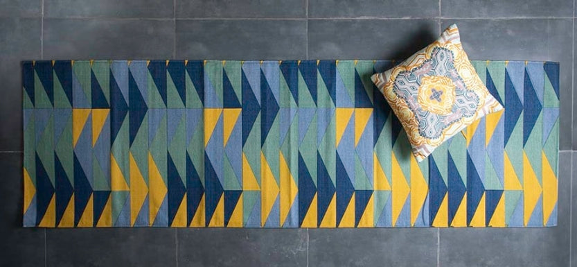
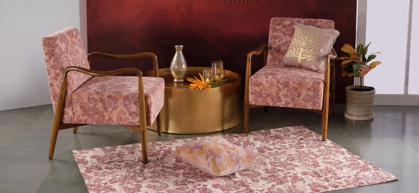
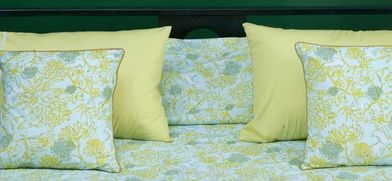
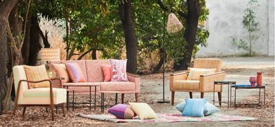
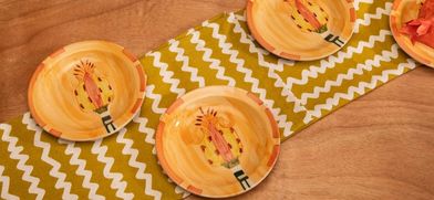
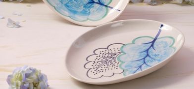
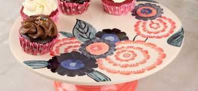
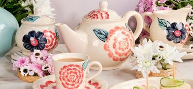
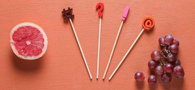
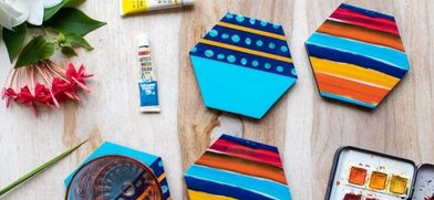
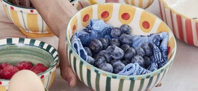
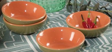
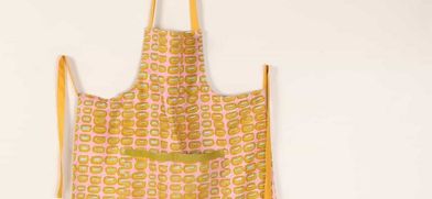
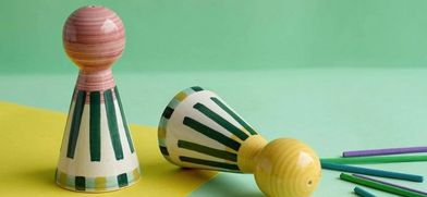
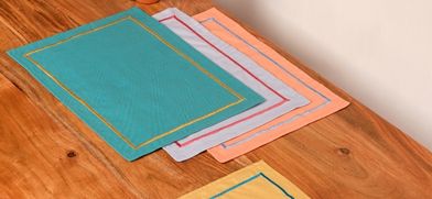
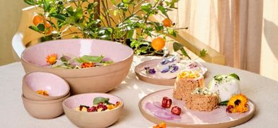
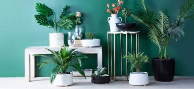
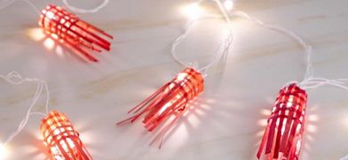
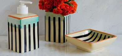
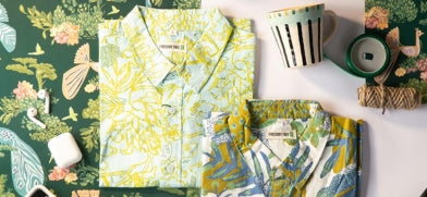
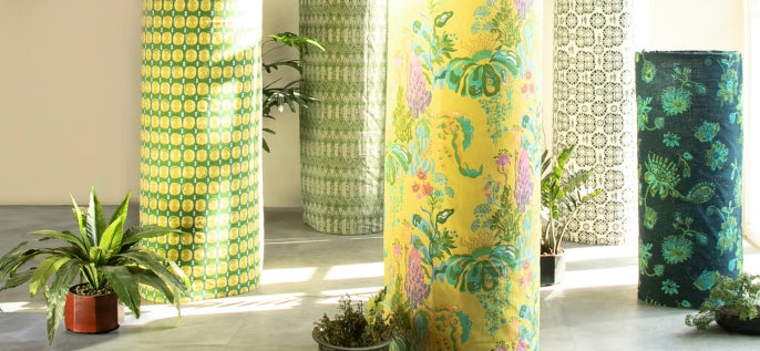
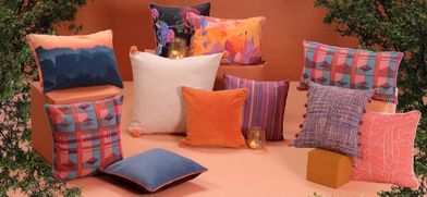
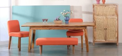
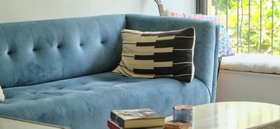
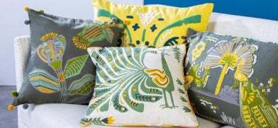
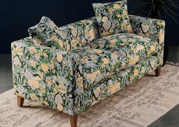
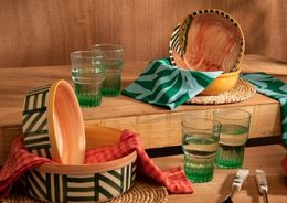
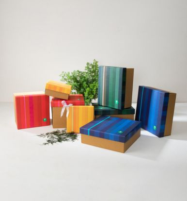
When OCHRE GOLD is bright enough to attract attention, we could use it as a solid color statement in contrast with balancing hues. Unexpectedly in the modern context, ochre combines beautifully with a trend of pastel colors.
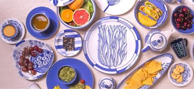
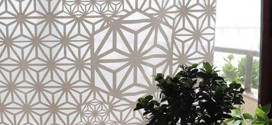
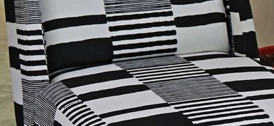
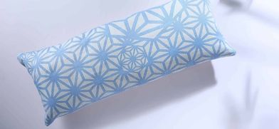
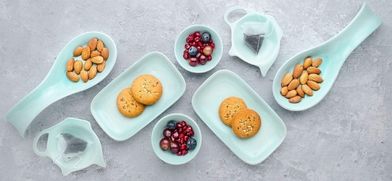
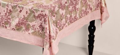
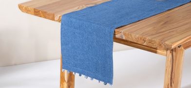
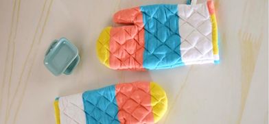
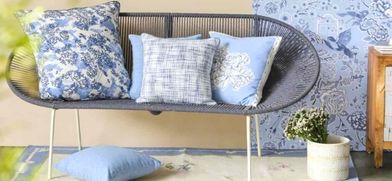
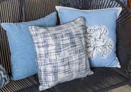
The refreshing energy that immediately gets noticed. For a smooth transition, these pastel tints of peach, sage green, duck egg blue are held back by black and white grids and geometries that are simple.


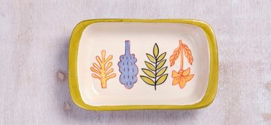
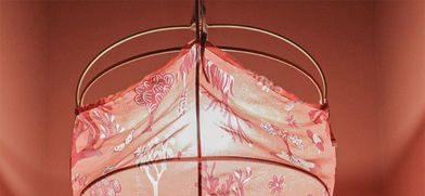
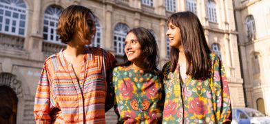
Look out for this cherished gold color tone not only in home decor but spot its applications in graphic design, architecture, fashion and beauty.


Leave a comment